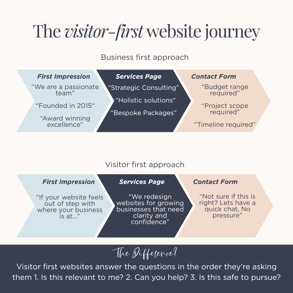
They're professional. Well-intentioned. Technically sound. They usually say the right things - just not in the right order, to the right person, at the right moment.
And that subtle misalignment? It’s costing you enquiries.
When a website underperforms, it’s rarely down to aesthetics or missing features. Nine times out of ten, it’s because the site is answering questions your visitor hasn’t even thought to ask yet—while ignoring the ones keeping them from clicking ‘contact’.
Let’s unpick why this happens, and more importantly, what actually works instead.
The emotional gap between you and your visitor
You live and breathe your business. You know the origin story, the late nights, the lightbulb moments. You understand why your approach is different, why you care about the details others overlook, and exactly how much thought goes into every decision.
Your website visitor? They know precisely none of that.
They’ve arrived emotionally neutral at best, mildly sceptical at worst- not because they doubt you specifically, but because they’ve been burned before. They’ve clicked promising links that led nowhere. They’ve read websites that sounded good but felt hollow.
This creates a chasm of context that most business owners don’t see coming.
You’re standing on one side with years of expertise and hard-won insights. They’re on the other with a problem they need solving and about 8 seconds of patience. Most websites try to bridge this gap by throwing their entire story across it, hoping something lands.
It doesn’t work like that.
The uncomfortable truth: Your website isn’t meeting people where they are – it’s meeting them where you wish they were. Where they already trust you, already understand your value, already want what you’re offering.
But they’re not there yet. And asking them to leap that distance in one go? That’s where you lose them.
The myth of the "engaged visitor"
Here’s a fantasy many business owners believe without realising it: that website visitors arrive ready to pay attention.
They absolutely do not.
They arrive while:
- Juggling three browser tabs and a half-drunk coffee
- Comparing you against two other options they can barely tell apart
- Nursing residual frustration from the last website that wasted their time
- Waiting for a meeting to start, or a kettle to boil, or a child to find their shoes
They’re not being difficult. They’re being human.
Your website doesn’t automatically deserve their focus just because you built it. Attention isn’t given – it’s lent, briefly, conditionally, and it can be withdrawn the second something feels off.
Think about your own behaviour. When did you last read a website homepage word-for-word? You didn’t. You scanned. You hunted for relevance. You made snap judgments about whether this was worth your time.
Your visitors are doing exactly the same thing.
The shift this requires: Stop designing for the person who’s carefully reading every line. Design for the person who’s half-distracted, slightly defensive, and ready to leave. Because that’s who actually shows up.
Why leading with "who we are" is usually a mistake
Open up most small business websites and you’ll see some version of this:
“We are a passionate, experienced team of [industry] specialists with over X years of helping clients achieve [vague outcome]. Founded in [year], we pride ourselves on our commitment to excellence and customer service…”
All true. All professionally written. All completely premature.
Because your visitor hasn’t answered their own question yet: “Is this even relevant to me?”
Until they’ve figured that out, everything else – your credentials, your story, your philosophy – is just noise they’re trying to filter through to find the signal.
Here’s what happens in their head:
“Okay, but do you actually do the thing I need? And do you do it for businesses like mine? Because I’ve been on three websites today that sounded great but turned out to be completely wrong for what I’m after.”
They’re not being rude. They’re being efficient with their already-limited attention.
The hard truth: Credentials don’t create relevance. Relevance gives credentials meaning. Get the order wrong and even the most impressive background becomes wallpaper.
Show them you understand their world first. Then, and only then, do your qualifications start to matter.
The website's real job: reducing uncertainty (not creating persuasion)
People don’t leave websites because they actively dislike them. They leave because something feels uncertain, and they can’t quite put their finger on what.
That uncertainty sounds like internal dialogue:
- “I think this is what I need… but I’m not 100% sure”
- “They seem good, but are they good for someone like me?”
- “I don’t really understand what happens if I get in touch”
- “This feels slightly too corporate/casual/expensive/vague”
- “I’ll bookmark this and come back later when I’ve got time to figure it out” (Spoiler: they won’t)
Your website’s primary job isn’t to persuade. It’s to systematically dismantle these quiet hesitations before they become reasons to click away.
Think of your website as a series of friction points. Every unanswered question, every unclear statement, every moment of “hang on, what do they actually do?” adds friction.
Enough friction and the visitor just… stops. Not dramatically. They just quietly decide this is too much work.
The reframe: A good website doesn’t push people toward a decision. It removes the small obstacles preventing them from making one. It makes the path from “curious stranger” to “confident enquiry” feel smooth and obvious.
When someone contacts you, they shouldn’t feel like they’re taking a leap. They should feel like they’re taking the next logical step.
The difference between expression and communication
This is where things get uncomfortable, especially for creative businesses and solopreneurs who’ve poured themselves into their brand.
Expression is about:
- What you want to say
- How you want to be perceived
- What feels authentic to you
- The image you’re building
Communication is about:
- What the other person needs to hear
- What they’re actively trying to understand
- What removes confusion and builds confidence
- The job they’re hiring you to do
Most websites lean heavily toward expression. They look beautiful. They sound “on brand”. They feel like a true representation of the business.
But they leave the visitor doing the heavy lifting – decoding language, inferring meaning, guessing whether this is right for them.
Here’s the test: if someone visits your website and then needs to message you asking “so, what exactly do you do?” or “would this work for a business like mine?” – your website is expressing, not communicating.
The uncomfortable truth: If your website needs explaining in a follow-up conversation, it’s not doing its job. It’s beautiful wallpaper with an unclear purpose.
The strongest websites are confident enough not to prioritise self-expression over clarity. They know that clarity is the most powerful expression of confidence.
What visitors are really doing when they "scan"
You’ve probably heard that people don’t read websites – they scan them. True, but that framing makes it sound lazy. It’s not.
Scanning is a survival mechanism.
When someone scans your website, they’re rapidly hunting for anchors:
- Familiar language that matches how they think about their problem
- Clear structural signposts (headings, subheadings, visual breaks)
- Signals of relevance (“Oh, they work with businesses like mine”)
- Markers of credibility (not logos and awards – specificity and honesty)
They’re not reading to absorb. They’re reading to check:
- ✓ Am I in the right place?
- ✓ Does this feel credible?
- ✓ Is this worth slowing down for?
If they find enough positive checks, they shift gears. They start actually reading. They click deeper. They begin to engage.
If they don’t find those anchors within seconds, they’re gone – not because your website is bad, but because it didn’t give their scanning brain anything to grab onto.
The practical takeaway: Your website doesn’t lose people because it’s poorly written. It loses them because it’s unclear where they should look, what matters, and whether this is for them.
Structure your content for the scanner first. Win their attention, then reward it with depth.
Why "it's not about you" feels so personal (and why that's okay)
For most business owners, their website feels intensely personal. Because it is.
It represents:
- Your livelihood and financial security
- Your professional reputation
- Years of work and expertise
- Your identity, especially if you’re a solopreneur
So when someone says “your website shouldn’t be about you,” it can feel like a dismissal of all that effort, all that care.
It’s not.
It’s a reminder that your website isn’t the place to process your journey – it’s the place to translate it into something immediately useful for someone who doesn’t know you yet.
Your story matters enormously. But it earns its place by being the answer to questions your visitor is actually asking, not the opening gambit.
The subtle reframe: Confidence isn’t announcing who you are at volume. It’s trusting that you don’t need to lead with your credentials to prove your worth. It’s knowing that when the right person finds you at the right time, your experience will be obvious—because it’ll be woven into how you talk about their problem.
Reframing the website as a conversation (not a presentation)
Imagine meeting someone for the first time at a networking event. You wouldn’t:
- Launch into your CV unprompted
- Explain your entire business philosophy before they’ve said a word
- Talk uninterrupted for five minutes about your journey
- List your qualifications before asking what they do
You’d read the room. You’d ask questions. You’d listen. You’d find common ground before offering anything.
Good websites follow the same social rhythm.
They open by acknowledging the visitor’s likely situation (“If your current website feels out of step with where your business is now…”). They listen by demonstrating understanding of the problem. They respond by offering a clear, relevant solution. They help by making the next step obvious and easy.
Websites that feel human don’t overshare upfront. They demonstrate empathy first, expertise second.
The practice: Before writing any website copy, ask yourself: “If I were talking to this person face-to-face, would I actually say this at this point in the conversation?” If the answer is no, it probably doesn’t belong there.
The four things your website should actually be about (in depth)
Let’s get practical. Instead of centering your website on your story, your credentials, or your services list, build it around these four visitor-focused pillars.
1. Naming the Problem Without Dramatising It
People don’t respond well to being told their situation is dire. It feels manipulative. But they do respond to having their quiet frustrations acknowledged in language that feels true.
The difference:
❌ “Is your outdated website costing you thousands in lost revenue every month?”
✓ “If your website feels out of step with where your business actually is now…”
The first creates pressure. The second creates recognition.
Most business problems aren’t dramatic. They’re persistent low-level friction:
- The website that technically works but you’re not confident sending people to
- The booking system that’s “fine” but adds ten minutes to every enquiry
- The brand that looked great three years ago but now feels like someone else’s
Your job: Describe the problem in terms your visitor has probably used in their own head. Not escalated. Not catastrophised. Just… seen.
When someone reads your homepage and thinks “God, yes, exactly that,” you’ve cleared the first hurdle. They feel understood, which is the foundation of trust.
2. Showing the outcome without overpromising
Visitors are suspicious of transformation narratives. They’ve seen too many before-and-after stories that don’t match reality.
What they actually want is to imagine a specific, believable improvement:
- Feeling calmer about sending people to your website
- Having clarity on what you offer and who it’s for
- Getting enquiries from people who already understand what you do
- Spending less time explaining basics in initial conversations
Notice how none of those are massive. They’re not “10x your revenue” or “transform your business overnight.” They’re tangible, modest, real.
The reframe: Relief is more persuasive than excitement. People want to solve problems more than they want miracles.
Paint a picture of life with the problem solved – not revolutionised, just… better. Manageable. Easier.
3. Explaining how you help without hiding behind jargon
This is where trust either deepens or evaporates.
Vague service descriptions feel safe to write (“We provide strategic consulting to optimise your digital presence”) but they create more questions than answers.
What builds confidence:
- Explaining how the process actually starts (a conversation, a questionnaire, a site audit)
- Being specific about what collaboration looks like (how many meetings, what you need from them, how long things take)
- Naming what you don’t do (boundaries build as much trust as capabilities)
- Using concrete examples instead of abstract benefits
The hard truth: Vagueness feels safer to write because it doesn’t exclude anyone. But clarity builds trust because it shows you know exactly what you’re doing and who it’s for.
If someone reads your “how we work” section and still can’t picture what actually happens, you haven’t done the job.
4. Making the next step feel easy, not heavy
Many websites accidentally make contact feel like a major commitment.
Long forms asking for budgets and timelines. High-stakes language like “Book Your Strategy Session”. Buttons that say “Get Started” when the person hasn’t even decided if they’re interested yet.
The best websites make initial contact feel lightweight:
- “Got a question? Just ask”
- “Not sure if this is right for you? Let’s have a quick chat”
- “Drop me a message and I’ll get back to you today”
Notice the difference in weight. One feels like you’re committing to a process. The other feels like you’re having a conversation.
The principle: The easier the next step feels, the more likely people are to take it. Remove every ounce of unnecessary friction from that first point of contact.
Where your story actually becomes powerful
Here’s what often gets lost in “visitor-first” advice: your story absolutely matters. Your values, your experience, your personality, the way you work – all of it is valuable.
It just needs to arrive at the right moment.
Once a visitor feels:
- Oriented (they understand what you do and who it’s for)
- Understood (you’ve demonstrated you get their situation)
- Safe (the next step is clear and low-pressure)
…that’s when they want to know who they’re dealing with.
That’s when your About page stops being a distraction and becomes a confirmation. That’s when “I started this business because…” changes from irrelevant to compelling.
The truth: Stories don’t earn attention. They reward it.
Your origin story, your philosophy, your credentials – they’re the dessert, not the main course. Serve them once someone’s already decided they want to stay for the meal.
Why so many websites feel "nice" but don't work
Most underperforming websites aren’t broken. They’re unfocused.
They try to:
- Say everything (instead of the essential things)
- Appeal to everyone (instead of the right people)
- Cover every angle (instead of making one clear point)
- Sound professional (instead of sounding human)
The result? A website that’s perfectly pleasant and completely forgettable.
The uncomfortable shift: A clear website chooses who it’s for – and by extension, who it isn’t. That feels risky. What if you turn someone away? What if you’re too specific?
But here’s what actually happens: when you narrow your focus, you become more relevant to the right people. And those people convert at much higher rates than the vague “anyone who might possibly need this” crowd.
Specificity doesn’t shrink your audience. It sharpens your appeal to the people who actually matter.
The shift that quietly changes results
When your website becomes genuinely visitor-first, you’ll notice something interesting: the quality of enquiries changes.
What actually happens:
- Enquiries become warmer (people contact you already half-convinced)
- Conversations start further along (less time explaining basics, more time discussing fit)
- You attract people who already “get it” (fewer tyre-kickers, more ideal clients)
- The website becomes a filter, not a funnel (which is exactly what you want)
The reframe: A good website doesn’t increase enquiry volume. It improves enquiry quality.
You might get fewer contact form submissions, but the ones you get will be from people who actually understand what you do, believe you can help them, and are ready to have a real conversation.
That’s infinitely more valuable than a hundred vague “just checking prices” messages.
The balance that actually works
The strongest websites aren’t:
- Loud (they don’t shout for attention)
- Clever (they don’t hide behind wit or jargon)
- Trend-led (they don’t chase whatever’s fashionable)
They’re:
- Calm (they feel confident, not desperate)
- Clear (they communicate without making you work for it)
- Considered (every element serves the visitor’s journey)
They feel confident enough not to rush. They respect your time and intelligence. They make you feel like you’re in capable hands before you’ve even made contact.
That’s the tone to aim for. Not impressive. Not flashy. Just undeniably clear and quietly confident.
A final reframe
Your website doesn’t exist to tell your story.
It exists to help someone else decide whether your story should become part of theirs.
When you design for that moment – for the person who doesn’t know you yet, who’s uncertain, who’s comparing options, who just needs enough clarity and confidence to take the next step—everything starts working harder.
And often, more quietly.
Which is exactly the point.
Ready to turn your website into a tool that actually works for your business? At Mint Sauce Media, we specialise in visitor-first website design that converts browsers into enquiries. Let’s talk about your website.