The secret to looking professional (without a big web design agency budget)
You’ve got the talent – genuinely brilliant work that you’re proud of – but somehow your website doesn’t quite match up. It’s not bad, exactly. It’s just… not quite giving what you know you’re capable of.
Maybe you’ve spent hours scrolling through templates, switching fonts, moving things around. And still, something feels a bit off. A bit “I built this myself” rather than “I’m a professional creative you should definitely hire.”
Here’s the thing though: professionalism isn’t about having a massive budget or hiring a fancy design agency. It’s about intention. It’s about making thoughtful choices that work together to tell your story clearly.
And the good news? Whether you’re using Squarespace, Wix, WordPress, or any other platform, there are simple, practical fixes that’ll elevate your site from “fine” to “wow, this person really knows what they’re doing.”
Let’s dig in!
Start with strategy, not style
Okay, confession time – how many of us have fallen down the rabbit hole of “I’ll just try this other template real quick”?
But here’s what actually makes a DIY site feel strategic rather than scattered: designing with purpose.
Before you change a single font or move any elements around, ask yourself: what’s the one main goal of your website?
Is it to book discovery calls? Sell prints? Get featured in publications? Land your dream client?
Whatever it is, write it down. Stick it at the top of your notes. Every design choice – every word, every image, every button – should nudge visitors towards that goal.
Think about your client’s journey, too. What do they need to see, feel, and understand before they’re ready to contact you? Map it out. Maybe they need to see your work first, then read about your process, then feel confident enough to reach out.
And please, please stop template hopping! We know it’s tempting (they all look gorgeous, don’t they?), but choose a layout that actually supports your strategy, not just what’s trending on Pinterest right now.
Pro tip: Before you change your fonts or layout, write down your website’s one-sentence purpose. Stick it at the top of your notes. Every change should reinforce it.
Curate like a gallerist, not a collector
Right, let’s talk about your portfolio itself. Because this is where things get tricky.
You’ve worked hard on loads of different projects. You want to show them all, don’t you? Prove how versatile you are, how much experience you’ve got.
But here’s the uncomfortable truth: a professional portfolio isn’t about showing everything. It’s about showing what fits the story you want to tell.
Think of yourself as a gallerist, not a collector. You’re carefully selecting pieces that work together to create an experience.
Here’s what that looks like in practice:
- Showcase only your strongest, most relevant work – we’re talking 5 to 8 projects max
- Lead with variety in style or story, not just volume
- Add short case-study captions that tell visitors what the brief was, your approach, and the actual results (people love seeing outcomes!)
- Keep visual rhythm by alternating between large and small images – give everything room to breathe
Ask yourself this: would you proudly show this piece to your absolute dream client? If the answer’s anything less than “YES!”, it doesn’t belong on your website. I know, it’s harsh. But it works.
Pro tip: If you wouldn’t proudly show it to your dream client, it doesn’t belong on your website.
Write copy that sounds like you – but edited
Oh boy, this is where so many DIY websites fall flat. And honestly? It’s usually not because people can’t write. It’s because they either sound like a corporate robot or they ramble on a bit too much. (We’ve all done it!)
Professional brands sound clear and confident. They sound human, but focused.
Here’s your new copy formula:
Write like you speak, then cut 30%. Seriously. Clarity equals confidence. Read it back – if you’ve used three words where one would do, trim it down.
Replace vague, fluffy lines like “I’m passionate about design” with actual proof: “I’ve helped over 30 brands refine their visual story.” See the difference? One tells, one shows.
Your calls to action should be friendly but directional. Instead of the boring “Submit” button, try “Let’s start your project” or “I’d love to hear from you.” Much warmer, right? 😊
Don’t forget the microcopy either – those tiny bits of text like hover states or form placeholders. They’re perfect little opportunities to show personality.
Pro tip: Read your About page aloud. If you’d cringe saying it to a client in real life, rewrite it.
Create visual harmony with limited choices
You know what kills credibility faster than almost anything? Over-designing.
I know, I know – you’ve got access to hundreds of gorgeous fonts and this brilliant colour palette you found on Instagram and you want to use all the things. But the most elegant, professional-looking sites? They use consistency as their secret weapon.
Here’s your design diet:
- Pick two fonts – one for headings, one for body text – and stick to them. That’s it. No more.
- Limit yourself to three brand colours: one neutral (probably your background), one accent (your main brand colour), and one highlight (for buttons or special elements)
- Keep your photo editing consistent – same tone, same brightness, same framing style
- Use whitespace generously – clutter signals uncertainty, space signals confidence
Every page should have a “hero” – one focal image or headline that anchors everything else. Give it prominence. Let it breathe. Don’t crowd it.
Trust us on this one – less really is more when it comes to looking professional.
Pro tip: Every page should have a “hero” – one focal image or headline that anchors everything else.
Polish the details most people overlook
Right, here’s where you separate yourself from the amateurs. Because these tiny touches? They’re what make your site feel premium, even if it’s built on a basic template.
The devil’s in the details:
First up: load speed. If your site takes ages to load, people will leave before they even see your gorgeous work. Compress your images before you upload them (TinyPNG is brilliant for this and completely free).
Check your mobile layout manually. Don’t just trust the auto-resize feature. Actually pull out your phone and click through every page. Does it still look polished? Can you easily tap the buttons? Is the text readable?
Use consistent spacing throughout – same margins, same padding. This creates a visual rhythm that feels intentional rather than thrown together.
Customise your favicon (that tiny icon in the browser tab) and your page titles. It’s such a small thing, but it signals that you’ve thought about every detail.
And please, please proofread everything. Typos ruin trust instantly. Get a friend to read through if you need to – sometimes we’re too close to spot our own mistakes!
Pro tip: View your site on a large monitor and on your phone side by side. Does it still feel polished on both?
Show up as the face of your brand
Here’s something that makes a huge difference: putting yourself in your brand.
Professional-looking brands aren’t faceless. They’re humanised. They feel like there’s a real person behind them. (Because, well, there is!)
Here’s how to do it right:
Include one strong, natural headshot – and please, not a selfie or a cropped group photo. Get a friend to take a proper photo of you in good light. It matters.
Use behind-the-scenes imagery: your workspace, your tools, you actually working on projects. People love seeing the process.
Add a friendly intro video or a short welcome paragraph in your own voice. Let your personality shine through!
Position yourself as the creative behind the craft – not just a name on a website. Share a bit about why you do what you do, what drives you, what makes you different.
Because here’s the truth: people hire people, not portfolios. Your photo and your tone do more to convert visitors into clients than you might think. We connect with humans, not with faceless brands.
Pro tip: People hire people, not portfolios. Your photo and tone do more to convert than you think.
Professional is a feeling, not a price tag
Look, you don’t need a massive budget to have a website that makes people think “wow, this person’s the real deal.”
You just need to make thoughtful choices. Cut the clutter. Show your best work. Sound like yourself (but edited). Keep things consistent. Polish the details. And let people see the human behind the work.
Even small tweaks can completely change how your brand is perceived. Sometimes it’s just about looking at your site with fresh eyes – a bit of a designer’s eye, if you will.
So go on, take another look at your website. What’s one thing you could improve today?
And if you’re thinking “honestly, I could use another pair of eyes on this”… well, that’s exactly what we’re here for!
Ready for an honest review? Book a Brand & Website Audit with Mint Sauce Media and we’ll give you specific, actionable feedback on what’s working and what could work even better.
Need your DIY site to look more high-end? Let’s chat about our Website design service. We’ll help you elevate what you’ve already built – no complete redesign necessary.
Because your talent deserves a website that shows it off properly. Let’s make that happen together!
Like Freebies? (of course you do!)
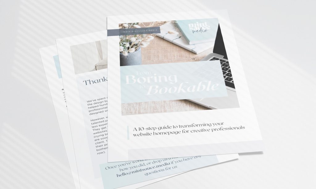
Get "Boring to Bookable" a FREE guide to give your website homepage a makeover
We created “Boring to Bookable: A 10-Step Guide to Transforming Your Website Homepage.” This comprehensive guide is designed to help you:
Stand Out: Learn proven strategies to make your homepage captivating and unique.
Attract Your Dream Clients: Discover how to design your site to appeal to the clients you truly want to work with.
Boost Conversions: Implement key elements that turn visitors into loyal customers.
Gain Confidence: Elevate your online presence so you can confidently raise your prices and grow your business.